SPA2011 - The Great Egg Race
At the SPA2011 conference, we set the attendees a challenge. We invited people to build something during the conference. We suggest they form teams, and use the challenge to show off their development skills, perhaps using a new technique learned at the conference, or showing everyone the benefits of the One True Way (whichever way they happen to think that is). We set aside time in the programme for people to work on their projects, but I think the majority of the work was done in the hallway, the coffee breaks, the bar, and possibly even in other people’s sessions… We gave the challenge the name The Great Egg Race after the 1980s BBC television series hosted by Prof Heinz Wolff.
Marc Evers and I facilitated, but we based the challenge on an idea from Michael Feathers that he presented in his XP2011 workshop Refactoring in the 4th Dimension. In that workshop Michael encouraged people to use his repo-depot ruby library to explore some data that he had extracted from some git repositories, to try and extract patterns over time. Is it more common for people to commit at some times of the day or the week rather than others? Are there correlations between commits and changes in complexity? etc etc
For the SPA workshop, we wanted people to focus on visualising the data in interesting ways. There was a strong theme going through the conference of Javascript, HTML5 and other presentation technologies. We wanted to harness interest in this and have people generate interesting visuals from the repository data. We announced the challenge in the opening plenary session on Monday. Somehow people found time in between all of the rest of the conference activities to come up with some pretty impressive things. Unexpectedly, Michael Feathers dropped by the conference as he was passing through London that day and came to see what people were up to, which was a nice surprise. At the closing plenary on Wednesday, our three finalists presented their work in some lightning demos.
Dear presenters, if I have described your entry wrongly below, please let me know and I will correct it!
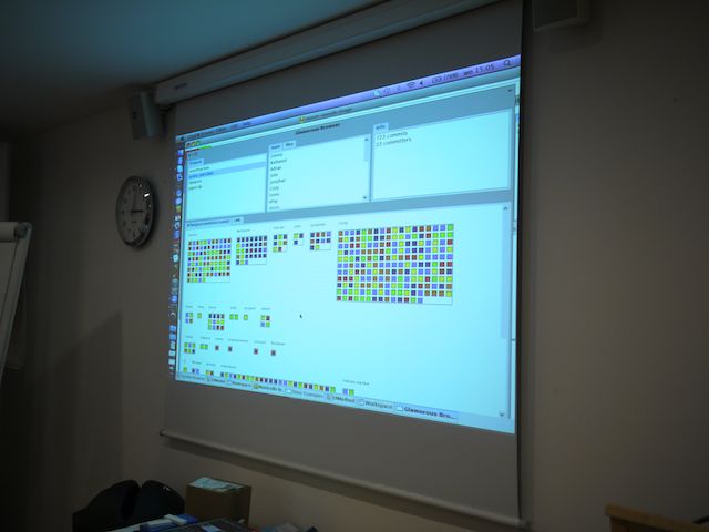
Stephan Eggermont and Diego Lont used their Smalltalk skills to create some extensions to the Moose platform to allow people to dig down into individual commits and changes. The visualisation uses a grid pattern with different colours representing code complexity.
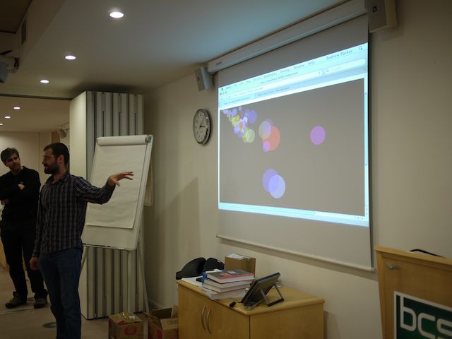
Andrew Parker produced a visualisation using animated circles to show change. The circles moved, grew and changed colour representing time and complexity, producing a moving chart in the style of Hans Rosling’s well-known presentations of data. A nice feature was how the colours faded out when the file wasn’t touched for a long time.
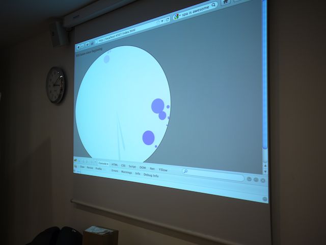
Lasse Koskela created an HTML5 visualisation based on a clock face. Time span forward through the history of the project being analysed, and as commits happened, they were displayed on the clock as the spinning hand passed them, this allowed the viewer so see which parts of the day were most common for checking in. He was also able to adjust the speed, to skip through times in the project’s history where he knew there was no activity, which was a nice touch.
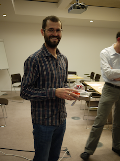
A quick and unscientific poll of the audience revealed that the majority of people liked Andrew’s entry the best, so he was declared the winner (and is pictured below with his prize). Thanks to everyone for taking part in the challenge, I hope you enjoyed it, and got to try out something that you might not normally get to do day-to-day. Thanks again to Michael for letting us use his tools as a starting point.
